
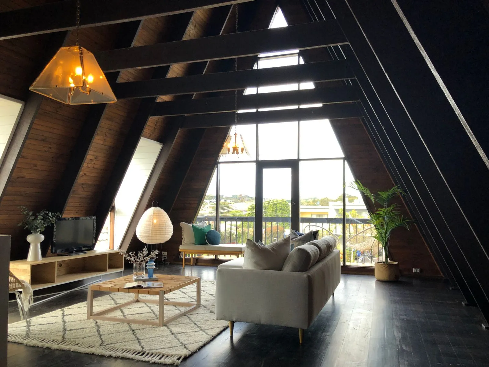
Choosing a paint color from a small sample can feel like picking a favorite in a lineup of near-twins. The same shade may look warm in one Auckland room and cool in another, depending on daylight, room size, and nearby materials. Before buying paint, look at how each space is used and what stays in it. A few simple checks can help you narrow the options and avoid choosing a color that clashes once it covers the walls.
Read the light in each room
Notice how daylight changes throughout the day before settling on a color. A north-facing room in New Zealand often receives warmer, more consistent sunlight, while a south-facing space may feel cooler and dimmer. Trees, nearby buildings, and window coverings also affect the light. Observe the room in the morning and afternoon, then check it again with the lamps you normally use.
Test paint samples on more than one wall, especially if one wall faces a window and another sits in shadow. Look at them at different times rather than deciding under a single burst of sunlight. A soft white can appear creamy in warm light but stark in a cooler room. If the color feels too intense on a large patch, consider a more muted version.
Match color to room size
Light colors can make a small room feel more open, particularly when walls and trim have a similar level of brightness. That does not mean every compact space needs white. A gentle, low-contrast color can still feel airy while adding character. If you prefer a darker shade, try it on one wall or use it in a room where a snug, enveloping mood suits the space.
In a large room, stronger or deeper colors can help the walls feel less distant. Before choosing, consider the ceiling height, furniture placement, and how much wall remains visible. A dark color may feel balanced in a spacious living area but overpower a room crowded with large furniture. Use sample boards to compare options without committing to a full wall.
Check surrounding finishes
Paint rarely sits alone. Flooring, cabinetry, benchtops, tiles, curtains, and wood trim all influence how a wall color looks. Some finishes have warm undertones, such as golden timber or beige stone; others lean cool, with gray or blue notes. Hold samples beside these fixed features. If the undertones compete, even a color you like on its own can make the room feel unsettled.
Keep a short list of finishes that will remain after painting, and take photos in natural light to help compare samples. For a coordinated look, choose wall colors that complement those materials rather than trying to match them exactly. If you are refreshing several connected rooms, view the colors together from the doorway. A simple transition between spaces usually feels more cohesive than several unrelated shades.
Make a confident final choice
Narrow your choices to a few samples, then test them at a generous size. Small chips hide subtle undertones and make it difficult to picture a full room. Leave the samples in place for a few days, and check them beside the room’s finishes in both daylight and artificial light. If the room is being renovated, test colors after the main flooring or cabinetry has been installed.
Consider the mood and upkeep you want, too. A calm bedroom may suit a soft, restrained shade, while a hallway can handle a little more contrast. In busy areas, think about how visible marks may be and ask your paint supplier about a suitable finish for the surface. Choose a color you enjoy seeing in the room, not only one that looks appealing on a small card.
The most reliable paint choice comes from seeing a sample in its real setting. Compare it in changing light, judge how it affects the room’s scale, and check it against finishes that will stay. Take your time with those three checks, and you’ll have a clearer shortlist. If you’d like help planning your Auckland home’s paint scheme, Bright Coat Painting can discuss your project.